Color in Motion
Gradients are everywhere—from the soft blending of sky at dusk to the sleek UI of your favorite app. At first glance, a gradient might just seem like a simple shift from one color to another. But when used intentionally, gradients can tell stories, evoke emotion, and add depth to design in ways that flat color never could.
In both art and design, gradients represent transition, harmony, and movement. They’re not just visual effects—they’re expressive tools.
What Is a Gradient?
A gradient is a gradual transition between two or more colors. It can move linearly (from left to right, top to bottom), radially (from the center outward), or along custom paths. These shifts can be smooth and subtle or bold and high-contrast. Gradients can be made from any combination of colors and can include transparency, texture, and even noise for extra effect.
A Brief History of Gradients in Design
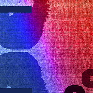
Gradients have come in and out of style across different design eras. In the early 2000s, they were synonymous with glossy buttons and over-the-top skeuomorphism in web and app design. Then came the flat design revolution, and gradients took a back seat for a few years. But they returned—smarter, sleeker, and more refined.
Today’s gradients are sophisticated. Think of Instagram’s iconic color blend or the atmospheric hues used in modern branding. Designers now use gradients not just for decoration, but to build identity, depth, and emotion into their work.
Why Gradients Matter
- Visual Appeal: Gradients add a sense of dimension and energy that flat colors can lack. They catch the eye and create visual flow.
- Mood Setting: Soft pastel gradients feel calming and dreamy; bold neon gradients feel futuristic and dynamic. The emotional range is wide and flexible.
- Symbolism of Change: Because they represent a shift, gradients can symbolize progress, transformation, or evolution—perfect for tech companies, wellness brands, or storytelling projects.
- Highlight and Focus: Gradients can be used to subtly guide attention, drawing the eye toward specific elements on a page or product.
Where You’ll Find Gradients
- Digital Design: In websites, apps, UI/UX, and branding
- Fine Art: As transitions in paintings, especially abstract or landscape works
- Fashion: In dye techniques like ombré and tie-dye
- Nature: The most beautiful gradients exist all around us—in sunsets, oceans, and even flowers
Creating the Perfect Gradient
Designers often balance artistic intuition with technical skill when crafting gradients. Here are a few tips:
- Color Harmony: Use colors from the same family or opposite ends of the spectrum depending on the effect you want.
- Blend Techniques: Experiment with transparency, noise, and layering to avoid banding (the unwanted lines where color steps are visible).
- Context Matters: A gradient that works for a mobile app background might overwhelm a business card—choose wisely.
Final Thoughts
Gradients are more than just aesthetic trends—they’re a visual metaphor for transition, complexity, and beauty in between the extremes. Whether you’re a designer, an artist, or just someone who appreciates color, gradients invite you to look closer and embrace the spaces in between.
In a world of sharp edges and bold lines, gradients remind us that not everything has to be black and white—sometimes, the most interesting stories are told in the blend.
Leave a Reply